

2021-2022
Albertsons Web Architecture
Albertsons’ web homepage was lagging behind modern design, but the high-stakes surface—with multiple cross-functional partners and competing team priorities— had no organized model for how it should evolve. As Director of Product Design, I led the effort to define a durable structure and roadmap for modernizing the experience.
Role
Director of Product Design, Web & Discovery
Team
2 Sr. Designers
(simultaneous to design leadership across Loyalty, UX Writing, UXR, contributing to the broader initiative)
Mandate
Modernize the web experience to support Albertsons’ “fresh” executive strategy, extend the newly-launched mobile design system to web, and establish a scalable structure for ongoing evolution across banners and business priorities.
Scope
Nationwide web platform across 22 banners, supporting discovery, promotions, loyalty, and monetized placements
Partners
CPG leadership, Web Production (AEM), Merchandising, Omnichannel, Partnerships, Engineering
Outcomes
Established a design-led operating model for the homepage that balanced monetization, brand, and customer clarity – reducing cross-functional friction, enabling faster updates, and supporting long-term revenue growth.
Why?
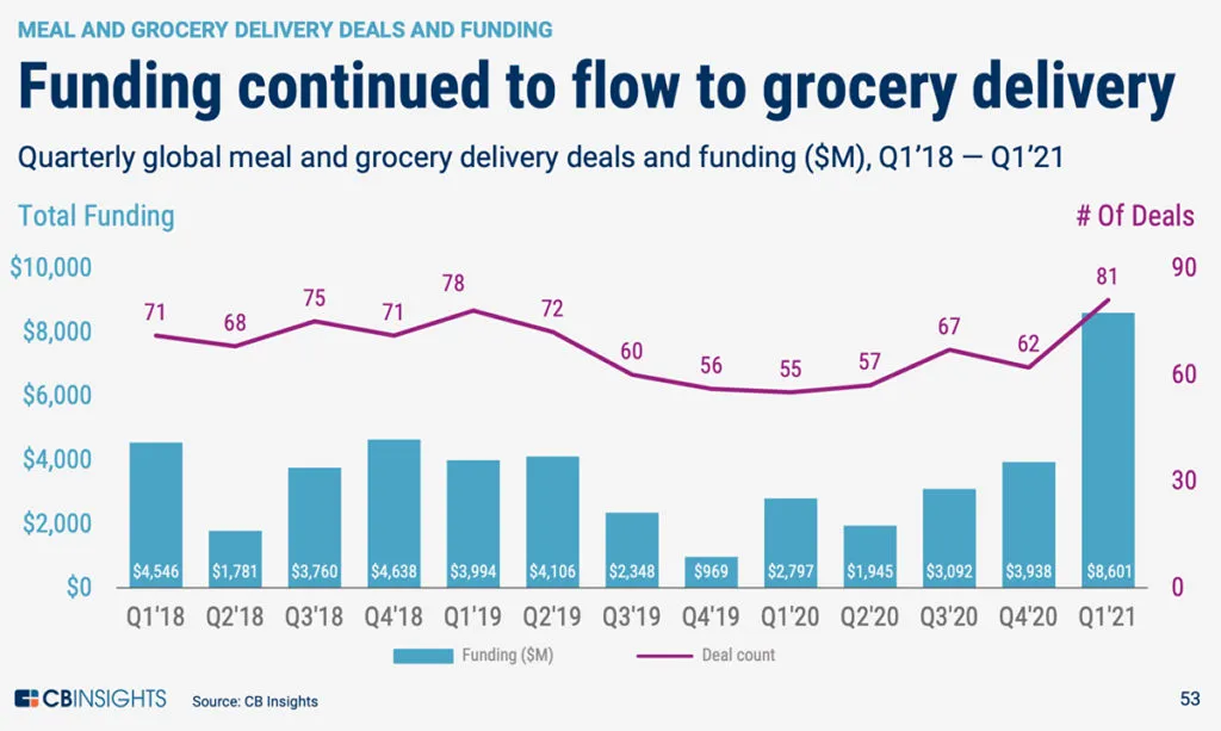
In the wake of the COVID lockdown, grocery stores were in overdrive improving their order and delivery flows. Before 2020, in-store shopping was supreme. 90% of shoppers bought weekly groceries in-store, but by 2021, digital demand altered this well-honed consumer landscape.
The Challenge
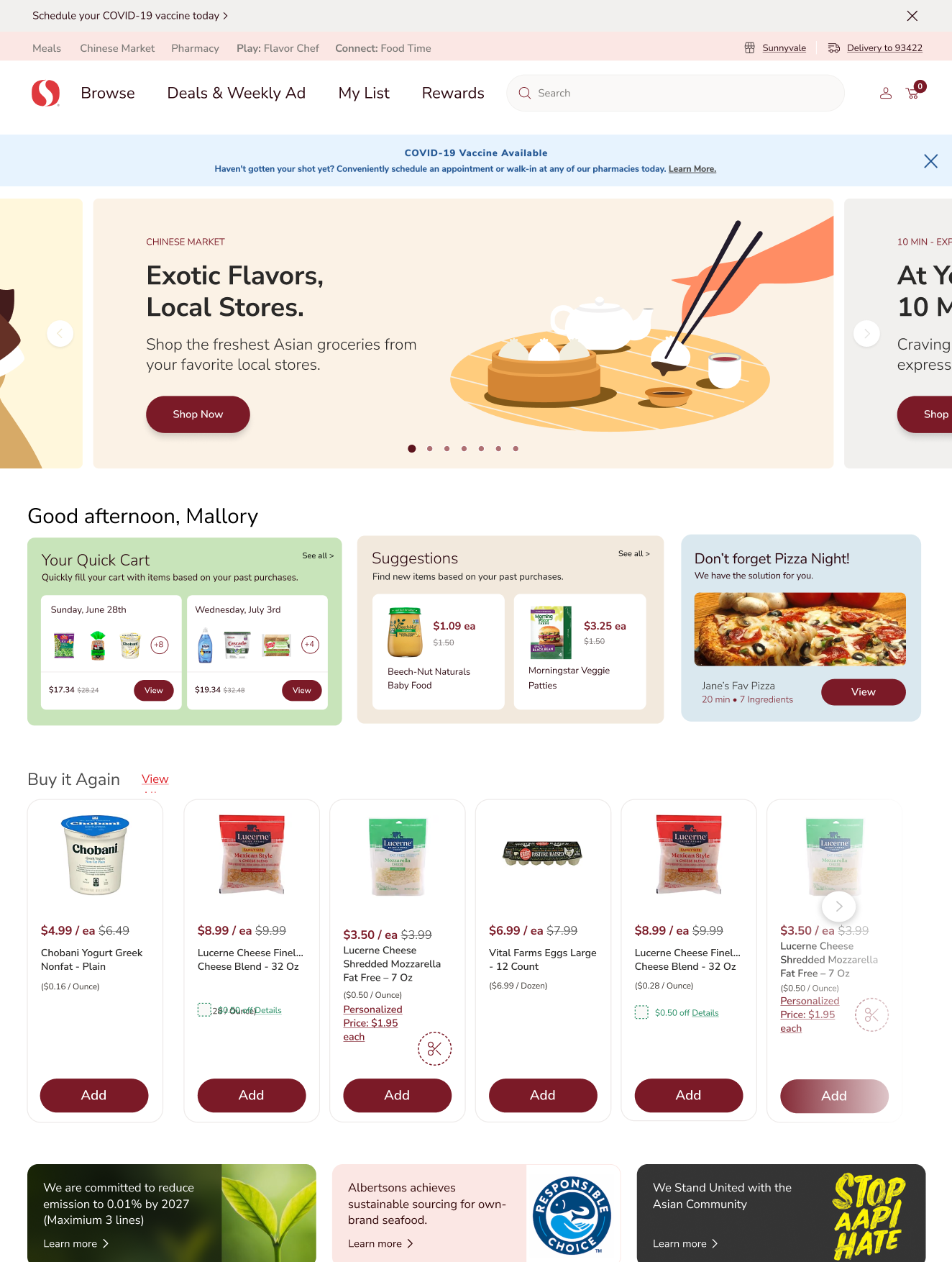
The Albertsons Companies' web architecture was in place, but it was both basic in design and in function. Only standard carousels were used, and the square corners and high-contrast colors did not reflect the warmth of the “Food Authority” design work we were releasing on mobile.
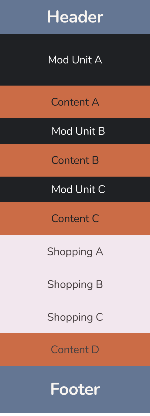
At the same time, the web was significantly more complex than mobile: the web infrastructure supported banner-specific coupons, each banner trafficked its own sales and promotions into key promo slots, and there were early personalization features like “4U” and “Buy it Again.”
As a design leader I was navigating tight timelines, competing priorities, and constrained resourcing within a highly visible surface. The Adobe Experience Manager infrastructure we used for promotions and banner-specific deals introduced additional limitations, making even small changes difficult and risky.
What made this especially challenging was that the most revenue-critical parts of the page were also the hardest to evolve.
Leadership Scope
The company was moving so fast that there was not a PRD for this high-visibility project. There were also many stakeholders (someone once called Albertsons “the most complex company they’ve ever worked for.”).
Design leadership for this project meant leading designers, hands-on conceptual wireframes, puzzling out myriad complexities with my cross-functional partners, and mentoring the junior product manager.
What the Data Revealed
My first step was to learn about our users. I was new to the company, so I needed to understand our business goals through the customer's eyes. I gathered old research and met with key stakeholders to verify or dismiss past assumptions. Together, we arrived at our key personas for 2021.
Some of the most surprising insights included how many people navigated immediately to the coupon area, how poorly the existing carousel converted, and the high value of the first card on any list page.
Knowing true numbers about user behavior was key to driving priorities and enabling buy-in on these priorities across the company.
Framing the Problem
It soon became clear that there was not any kind of structure or governance that helped all our partner teams understand how, and when, they could make changes.
I framed the problem as a shared surface that needed to be modernized and scale. With this reframe we could better define goals: more engagement with the home page, particularly below the fold; improve the visibility and performance of CPG placements by opening up the framework; increase opportunities for CPGs and internal programs both above and below the fold.
The cherry on top was the movement towards visual alignment with mobile, but it was not the work our cross-functional team had to do.
The Zones Model
On the design side, we could lead with the question what jobs does this page actually do? I created a zone framework that allowed us to ask, zone by zone, what jobs needed to be done. Each zone was not just a stripe, but also a design-led RACI that helped sharpen discussion. Even better: not everyone had to be in all the meetings, all the time. Instead, we had targeted meetings that allowed us to go in-depth on tricky areas, like where AEM introduced tough technical constraints.
Even before any visual changes were presented, conversations shifted. Each team knew how to define metrics and could understand how we were slotting in goals and visuals together.
From Strategy to Execution
For the home page, I worked with my partners to break out key areas of the page, prioritize, and then define the page’s framework and governance methods.
For the full system, I mapped out a strategy for how all shopping components would evolve—not just visually, but also personalized.
When leadership asked me to shift focus, my role moved from driving design to enabling execution. With structure in place, the team was able to carry the work forward without disruption.
Outcomes & Impact
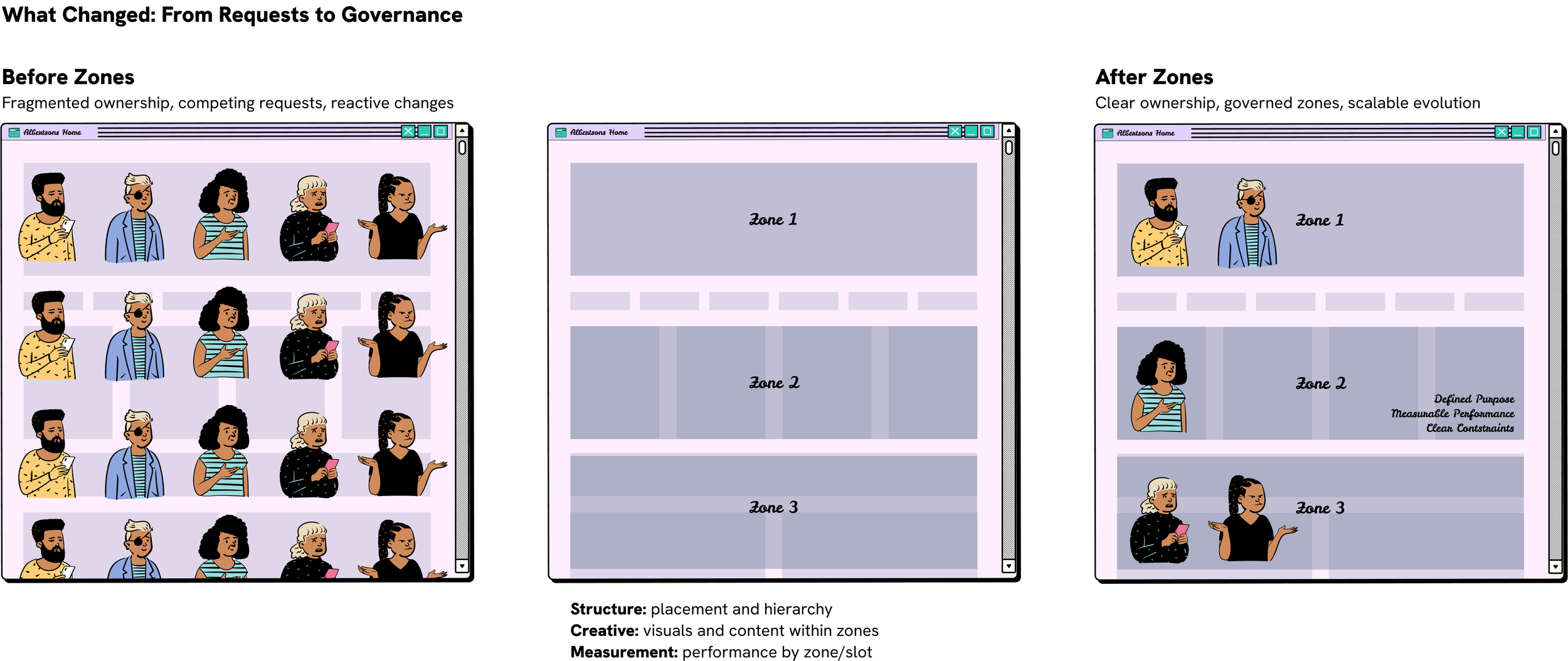
This work fundamentally changed how the organization governed one of its highest-stakes digital surfaces. By introducing zone-based decisioning, homepage strategy shifted from reactive negotiation to an executive-level operating model grounded in user behavior, business priorities, and platform constraints.
By separating structural strategy from visual expression, the framework also unlocked creative leadership—allowing a Creative Director to independently evolve content visuals within each zone while preserving consistency, performance, and system integrity. Together, these outcomes established a scalable foundation for continued modernization well beyond the initial phase of work.
What Endured
What endured from this work was a repeatable, measurable operating model for modernizing the web experience, grounded in structure rather than one-off redesigns. By establishing zone-based governance and clear success criteria, the team gained a shared way to evaluate homepage decisions based on customer behavior, business impact, and system constraints.
Established a design-led operating model for governing complex, high-stakes digital surfaces
Clarified ownership and decision rights across Product, Marketing, CPG, Engineering, and Creative, reducing organizational friction
Shifted the organization from episodic redesigns to continuous, system-based evolution
Enabled meaningful measurement by zone and placement, supporting smarter prioritization over time
Created space for independent creative leadership within a stable, scalable framework